The problem with YARNBOMBING

À basic definition of YARNBOMBING is found in WIKIPEDIA “a type of graffiti or street art that employs colourful displays of knitted or crocheted yarn or fibre rather than paint or chalk”(1)

A more comprehensive definition is

Yarnbombing is part of street art, part graffiti, part activism, which combines the seemingly “cute”and comforting elements of knitting and crochetin , with the revolutionary and mild civil disobedience of graffiti/”tagging”of public objects, in order to make some sort of artistic statement. (2)

This references the “cute”nature of yarn bombing but does not include the what, for many, is the most important aspect of the action. Many practitioners refer to using yarnbombing in order to feminise a space ,or an object.

Feminised tank -artist unknown

(3)

It is useful to consider where yarn bombing fits in the general art world. While a definition of graffiti places many pieces in that context, the larger (and probably more thoughtful pieces) align themselves with the wrapping work of Chris to and Jean-Claude (4), and work within the Soft-Sculpture movement. (5) . Yarn bombing is often carried out by participants who have no connection to the formal art world and thus it could be considered as “outsider” art.

Yarn bombing hasbecome so ubiquitist there are books sold on AMAZON with HOW TO DO instructions. (6) This availability must inevitably lead to an increase in Yarn bombing.

The problem with Yarn bombing arises from the very ease of producing the elements that make up a piece. Knitting is not an expensive craft to learn nor is it particularly difficult. À beginner can produce a reasonable square of kniiing after a couple of lessons and a few hours practice. Obviously pattern knitting and three dimensional shaping are skills that take time and practise to master. Close investigation of Yarn bombing work shows that most of it is made of basic shapes in basic knitting techniques joined together to make a larger work.

Bright colour is often a feature of Yarn bombing work. This is usually achieved by knitting stripes in a basic unit, or combing different coloured basic units. High quality specialistvyarns are quite expensive but mass produced acrylic yarn is readily available in supermarkets. Most knitters accumulate a stock of single balls of Yarn left over from previous projects, and charity shop sell off mixed lots. These accumulations mean that multi-coloured work is easily achieved.

Knitting is a craft that can be practised within a group. The participants all work on their individual units in the same place and interact socially as they work. In a communal setting this engenders a cohesive and supportive group. Combined with the initial ease of production and relative cheapness of the materials , this makes yarn bombing an ideal activity for community groups. These can be “oneaction”groups (7)or more substantial and continuing groups.

Yarn bombing falls into two main areas. Some practioners produce forms that imitate the real world in some way. The second type works in a more abstract way, interacting more directly with the physical environment.

THIRSK Yarnbombers began in 2015 and has involved up to 300 local people. It’s work has become an important part of the local attractions (8). Their work is well documented on their Facebook page (9) and on the Thirsk Tourist Information page. (10) It is clear from the photo that the Thirsk yarnbombers have a level of skill well above the basic.

This type of Yarn bombing aims to be amusing, “cute”(11), to make you smile. H owever it is very much an individual taste as to whether the viewer enjoys these pieces or finds them horrendous kitsch.

Thirsk teletubbies -poor photo

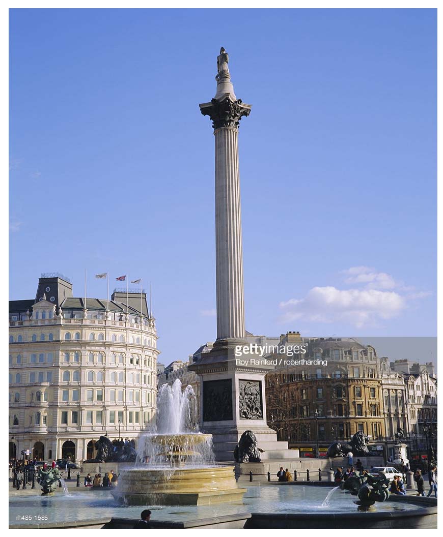
Again the abstract yarnbombers tend to work communally but their work often involves wrapping street furniture, trees and even public monuments.

Bombed trees

(12)

(13)

Less successful bombed trees

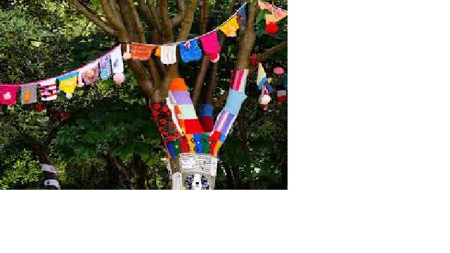
It is clear from these two images that abstract Yarn bombing is not necessarily visually successful, no matter how worthy the aims of the community group involved.

Whether or not the work is visually appealing or artistically justifiable there are two further linked problems, the yarn used and the dismantling of the piece. Whether the yarn is natural (wool,cotton) or artificial (e.g. acrylic, polyester)it will fade and disintegrate. Wet weather will cause anything made in wool to sag, some yarns will shrink and where a mixture of yarns are used in time the piece will appear puckered. Sun will eventually fade the colours and aide the deterioration of the yarn.

Further there are environmental concerns

Yarn bombing has been under some scrutiny for the potential negative environmental impact that the yarn can have when placed on plant life. Yarn can restrict sap production on trees and constrict growth. (14)

Most yarns are a combination of fibres. While wool and cotton will eventually rot away, synthetic fibres will simply be around for ever adding to the pollution of the micro-climate.

It is clear that part of any yarnbombing is the dismantling of the work and the clearing away of the materials used. Chris to and Jean-Clude carefully removed all their work, even dismantling it early when it became damaged by the weather (15) They often disposed of the materials used by donating it to locals.

It is sometimes difficult for community groups who have worked long and hard on a project to realise that its temporary nature is an essential part of the project.

So what are the problems with yarnbombing. The problems are those found with any installation. Either it appeals to the viewer or it doen’t, it is well done or it isn’t, it achieves its aims or it doesn’t.

And if there is too much of it, remember that it is g raffitti when all is said and done

NOTES

(1) https://en.Wikipedia.org/wiki/Yarn_bombing

(2) https://davidcharlesfox.com/whar-is-yarn-bombing-about-the-guerrilla-knitting-art-movement/

(3Kristina Kroemer in davidcharlesfox.com

(4) c.f. the wrapping of the Pont Neuf and te “bombed bridge”.

(5) https://www.artsy.net/gene/soft-Sculpture for a brief overview

(6) AMAZON listed8 books under the search title YARNBOMBING

(7)Groups of knitters came together to decorate their areas during the Tour de France in Yorkshire

(8)https://www.visitthirsk.org.uk/pages/yarnbombers.pho

(9) https://www.Facebook.com/tyb2016/photo

(10) http://www.visitthirsk.org.uk

(11) https://www.macmillandictionary.com/dictionary/british/cute defines cute as 1) attractive, usually small, and easy to like 2)informal -sexually attractive

(12) artist unknown

(13) artist unknown

(14) wikipedia/wiki/yarn_bombing

(15) After it was installed, the builders removed it 14 days later, leaving novisible trace behind . See https://en.Wikipedia./org/wiki/runing_fence

A feminised tank ‘-artist unknown

b

Posted in Uncategorized | Tagged , , | Leave a comment

Plinth or not

Some random thoughts about the use and importance of the plinth.

The plinth is ubiquitous. Galleries, public spaces, retail outlets all have objects stuck on plinths.

We accept these columns without out really considering them.

A plinth is defined as ‘ the support of a statue or a vase.’1

To reduce a plinth to its basic components: it is a three dimensional structure with, usually, three pairs of opposing rectangular sides, displayed standing on one of its horizontal faces.2

cube 3

Clearly the dimensions of each pair of faces can vary so that we can have a short or tall plinth . Or a wide or thin plinth. While usually a plinth can have a rectangular cross-section , the cross-section can be circular or elliptical

These structures have varying names yet all fit within the physical description and provide support for objects (though not necessarily a statue or vase).

A very shallow but wide plinth is usually referred to as a dais , increase the height slightly and shrink the base and the dais becomes platform. As we shrink the base area and increase the height our plinth becomes a pedestal, Continue this change in relative dimensions and our pedestal becomes a column until eventually it reaches the dimensions and stature of Nelson’s column. The change in dimensions does not alter the purpose of the plinth , to support and display an object.

Beatrice Hoffman , in discussing the use of plinths in placing garden sculpture gives three reasons for their use: practical, framing, status.4 It is useful to consider these reasons independently although they are related and influence each other.

The practical use of a plinth is fairly obvious. A delicate object placed on a plinth is protected from knocks and upset by the physical bulk of the plinth. Outdoors the plinth raises the object above the surrounding ground protecting it from mud splashes and the possibility of being over grown by encroaching vegetation.

The discussion around the use of the frame in art is complex. Derrida gives some thought to the idea of the frame and seems finally to decide that it does not exist.5

We can say that, in 2-dimensional art, the frame defines the edges of the work. In traditional presentation all of the artists ideas are presented inside the frame. The frame also serves to draw attention to the work here drifting into the area of increased status.

Placing an object on a plinth puts a metaphorical frame around the work. The plinth tells the viewer that this is the object that you should be looking at . Like the frame the plinth separates the object from its surroundings.

The framing effect , together with the height of the plinth serve to give the object a status in the eye of the viewer.

The height of the plinth serves to dictate the angle at which the viewer sees the object. A small object can be lifted up to eye level making it easier to see. When the artist controls the height of the plinth then the artist has control over how we view the object.

A plinth is often used to raise an object above head height so that it is viewed from below. The height of the plinth gives importance to the object placed upon it. The correlation between height and status seems to be ingrained in our psyche. Everyday speech is full of phrases that accept this idea: “ he gets above himself”, “ the glass ceiling” , “ climbing the ladder of success”. Literature is full of examples. The Bible refers to God ( the ultimate status symbol) as being above and those below being in a lesser state.

The problem that arises when an object is placed at height , is that it can not be seen clearly. It may be only partially visible and being viewed from below will appear strangely distorted. The paradox arises is that the object is given great importance but is concealed from view. Thus the fact that the object is on the high plinth is what is important not the object itself.

nesons coumn

Nelson’s Column from below      6 

nelsons columnand in it’s totality 7

A statue of Yuri Gargarin, while not taking the plinth to the heights of Nelson’s column illustrates this clearly, and has produced many complaints.8


pinth

Nelson’s Column also introduces us to a further consideration.

What is the plinth and what is the object?

In many cases, where the plinth clearly relates to the object placed upon it, that is its construction ( design , inscription ) has a clear relationship to the intention of the object, it becomes obvious that the object and the plinth together form the work.

It is clear from these thoughts that the plinth has an importance of its own. While we ignore it in our admiration of the object it displays , the choice of plinth has a direct it unacknowledged influence on how we view that object.

2Personal description

4 http://www.beatricehoffman.co.uk/about/sculptures-in-garden. She has a considerable discussion with illustrations

5Powell Tim, Derrida for Beginners, For Beginners LLC,USA, 1997

Posted in Uncategorized | Tagged , , , , | Leave a comment

FROM EAR TO EAR TO EYE

Nottingham Contemporary Gallery

As the mini-catalogue states in the introduction the exhibition ‘explores sound, music and listening’……’ ‘in places cross the Arab world’.

I found the exhibition interesting and , thought provoking and worthwhile. I have two problems with the exhibition , one problem with it is the implication that some how this exhibition is a comprehensive survey and the second is ( as ever) the video works.

A large proportion of the artists have connections to Beirut, and many are now based in Europe or the USA. There are two issues here. The Arab Word is not homogeneous, in culture, geography or experience. We can not make assumptions about other artistic parts of the Arab word from the products of one area.

Artists who reside outside of their home culture have a different view, possibly a more balanced view, of their originating culture than an artist who is singularly immersed in that culture. Their view has to be influenced by the norms and culture of the area where they reside.

A number of the works in this exhibition involved video works. I find video works particularly difficult to appreciate , for me they often seem to be badly made snippets of movies, or documentaries that lack form and shape to their story.

It is some weeks since my visit to this exhibition and four pieces stick in my mind.

EARSHOT by Lawrence Abu Hamden is an installation piece. In a darkened room hang clear panels the size of a standing human. Each panel is printed with a spectrogram produced from the sound of a bullet shot. A smal video is subtly inserted into the work that tells the story of the shots that the work analyses. The piece is visually impressive without any knowledge of the story that lead to its production and even more so once the story is known.

In Jumana Manna’s video , A MAGICAL SUBSTANCE FLOWS INTO ME, she follows in the footsteps of musicologist Robert Lachmann, visiting and recording the music of minority communities in Israel and Palestine. This piece is beautifully filmed and very slowly paced. Each image, each conversation, each musical ‘performance’ is given full attention. The effect is mesmeric and fascinating. This video piece has all hallmarks of a documentary but it is so much more.

A more obviously documentary piece THIS LEMON TASTE OF APPLE, by Hiwa K, is involving in a different way. A film of a protest , shot at eye level , appears to be the raw unedited footage. The length of this piece and the unwavering angle, drags the viewer into the protest and becomes more involving than brief glimpses we see in news footage.

Mounira Al Solh shows work that arises from her interactions with refugee and immigrant communities. “ ….for each person she creates specific patterns , which she co-embroiders with women refugees….”. These small embroideries are simple in design and execution. As textile works they fail to satisfy. Technically they seem to have no relationship to the rich decorative embroidery tradition of the participants, presenting what seemed to me to me patronising and superficial images. Having checked out her web presence I may be doing her a disservice, the best I can say is that this work shown here is a poor selection from her oeuvre.

Despite my problems with parts of this exhibition, a worthwhile experience.


Posted in Uncategorized | Tagged , , , , , , , , | Leave a comment

The fourth plinth revisited.

David Shrigley’s offering on the fourth plinth is due to be replaced in March 2018. Before it disappears from site it is worth, I think, looking at this work again.

Superficially it is a fist making a ‘thumbs-up’ gesture with the thumb elongated so that it appears more like a finger. Jonathon Jones describes it as ,gleefully ugly’i .

4th plinth 2 ii        4th plinth 2iii

Shrigley has entitled this work REALLY GOOD. One has to ask does the title refer to the idea that the sculpture proposes or to the work itself.

In an interview Shrigley said,

“I made a drawing of an elongated thumb that said everything is good and I wrote some text that sounded like some sort of weird political satire: If we make this sculpture, we can make the world a better place through some kind of self–fulfilling prophecy.”

Does this sculpture actually say what is claimed for it?

The meaning of the ‘thumbs-up’ gesture is at best ambiguous. In Europe and the USA the sign is taken to mean , GOOD and OK and is a positive signal. However in parts of Africa and the Middle East the sign is seen as pejorative. As a child in Australia I was taught that this was a rude gesture and I learnt later it was saying ‘sit on this’ or more specifically ‘up yours’.iv

So the sculpture is saying ‘Really Good’ to the local population, but is seen as exceptionally rude to many overseas visitors.

The message of the sculpture is further complicated by the elongated thumb which actually has the dimensions of a finger. The gesture of ‘giving the finger’ ……..‘is an obscene hand gesture. The gesture communicates moderate to extreme contempt, and is roughly equivalent in meaning to “fuck off,” “fuck you,” “shove it up your ass,” “up yours,” “suck my dick,” “eat shit,” “kiss my ass,” or “go fuck yourself.”’v Not only is it seen as obscene in Western culture , its use in the Middle East and Asia is so offensive as to lead to prosecution.

The dimensions of the thumb in REALLY GOOD actually appear phallic ( which co-incides with the underlying origin of the ‘finger gesture’).

As far as I can see this work is far from saying REALLY GOOD, but is telling all viewers to take a hike. This may of course be what Shrigley intended and he is having a laugh at the viewers expense. It is hard to believe ( though possible) that Shrigley is not aware of the alternative meanings contained within his work.

Work to be displayed on the fourth plinth is chosen by a highly literate and educated group known as the FOURTH PLINTH COMMISSIONING GROUP. vi The selection is then signed off by the Mayor of London ( REALLY GOOD was selected at the end of Boris Johnson’s term and the beginning of Sadiq Khan’s.)

Before the work is finally commissioned the maquettes being considered are on display for public comment.

It seems astonishing that there appears to have been no acknowledgement of the problematic meanings of the work. Or if there was, the commissioning group went ahead anyway.

As one commentator wrote …………….’And thus it came to pass. Really Good will take up its position in 2016, an ugly monument to empty cheer, 10ft tall and hollow in every sense. Your correspondent may enter the National Gallery via the back entrance for the duration of its tenure’.vii

Ignoring the gesture, the title REALLY GOOD is as ambiguous. Is Shrigley telling us that the piece itself is a ‘good’ work of art. Clearly this is debatable , and a matter of opinion. Or is he telling us that it is a really good thing that his piece has been chosen. Both of these interpretation of the title are possible. Shrigley does seem to have a certain defensiveness about his art.

Talking about his final degree show, Shrigley later told UK daily newspaper the Guardian‘s Becky Barnicoat, “I thought my degree show was brilliant, but the people who were marking It didn’t. I got a 2:2. They didn’t appreciate my genius….viii

There is also a divergence of opinion about his work . He was nominated for the TURNER PRIZE in 2013 although

Guardian art critic Adrian Searle …………………..believes David Shrigley should have made the shortlist years ago (he put him forward when he was on the 2004 jury, but was laughed down). ix

While not wanting to encourage or support censorship I find it difficult to understand why a work that is so overtly offensive was chosen for such a prominent position. We can pretend all we like that the gesture is telling us that everything is OK. Sorry it isn’t.


iiReally Good. Photograph: Jack Taylor/Getty

ivhttps://en.wikipedia.org/wiki/Thumb_signal A good start to looking at the meaning of the gesture in various countries

vihttps://www.ica.art/sites/default/files/downloads/FourthPlinth-ICAPublication.pdf for a discussion of this group. Written in 2013 but still relevant

Posted in Uncategorized | Tagged , , , , , , , , | Leave a comment

The ‘NEW’ Whitworth Gallery.

The Whitworth Gallery in Manchester has recently re-opened after considerable extensions to the building . A number of special exhibitions have been mounted to mark the re-opening.

It is so long since I had visited the WHITWORTH that I can not remember the previous lay out and I am unable to compare the new with the old. The new spaces though are pleasing , and appear to be flexible. There is though a rather curious space , on the way to the restaurant, that seems accidently empty . The visitor wants to hurry through.

The most lingering memory of the gallery is the almost complete lack of signage. It was completely impossible to find the toilets! No signs pointed in any direction. We found the toilets under the restaurant but one for each gender is surely not the only toilet provision for such a large gallery. Later we found a toilet at the back of the Museum Shop – but no sign outside the shop to indicate the treasure within.

Both the WATERCOLOURS and PORTRAITS were hung in the manner of the RA Summer Exhibition, works hung in columns so that many were well above eye level and many below eye level. I feel that a bit more space between the works would have helped and also some judicious editing . In this exhibition less would have been more.

Labels on pictures always cause a problem. Detailed labels beside works often cause bottle necks around the works as the viewer goes in close to read the label and gets entangled with the viewer who is standing back to view the work. The Whitworth has chosen to deal with this problem by having no labels whatsoever. Instead they provide printed sheets with the works numbered and a list of credits for the works. While this removes the melee in front of individual works it creates more problems than it solves.

Each sheet referred to a numbered wall. BUT I couldn’t find any numbers on the walls. So the first problem was to work out which wall I was looking at by trying to uncode the layout of the paintings, not easy when they were all much of a size.  In both galleries the lighting was very low, clearly necessary for the watercolours, but this made reading the description sheets very difficult.

I am sure there were some interesting works in both these exhibitions   but in the end I gave up. The experience of viewing these exhibitions was disappointing and ultimately uncomfortable. Interestingly the signs in the Cornelia Parker exhibition were well placed and completely adequate, perhaps a different curator?


The problems that I experienced at the Whitworth lead us to consider what exactly is the purpose of labelling exhibits. Art Galleries in general aim to be inclusive, to encourage attendance of the general public and not pander to the specialist viewer. I suggest that   labels should provide essential information and ultimately labels should enhance the visitors’ experience. There is clearly a balance to be struck between too little and too much information but for a serious viewer the artist , the date of production and the title are a minimum.   This minimum information gives the general viewer some indication of the artist’s purpose and a jumping off point for a search for further information.

I find the adoption of this method of display very curious. Unless I have missed a development in museum display thinking , then The Whitworth has deliberately returned to a 19th century display mode. While innovation and experiment is to be encouraged there were good reasons for gallery display to move away from the type of display used here.

In summary , despite the quality of the exhibitions , the lack of information signs, together with the crowded displays with their lack of accessible information made for a disappointing experience.

Posted in Uncategorized | Tagged , , , | Leave a comment

Richard Tuttle and the Turbine Hall

I Don’t Know. The Weave of Textile Language is the title of Richard Tuttle’s   work exhibited in the Turbine Hall at Tate Modern until the 6th April 2015.


I was particularly eager to view this work. In my own practice I use textiles and textile techniques in sculptural pieces and installations. There is a dearth of work using textiles in public view and here was a chance to be wowed .

I do not know where to start with this work.


Perhaps the first place to start is the selection of Richard Tuttle as the artist to fill the challenging space of the turbine hall. He is regularly described as being “known for his small, subtle, intimate works”[1]. Although he has produced larger works including, “ In 2004, …… Splash, his first public art project, a mural 90 by 150 feet with about 140,000 pieces of colored glass and white ceramic tiles. It stretches up the side of a luxury condominium building designed by Walter Chatham for a private, guarded island community in Miami Beach called Aqua.”[2] He seems an unusual choice .

tuttle1[3]


Not necessarily relevant is the source of sponsorship for this installation. The last of the UNILEVER Series in the Turbine Hall was in 2012 with work by Tino Sehgal.[4] HYUNDAI will take over the sponsorship in 2015.[5] No sponsor was listed in the general publicity for the Tuttle work. This does raise several questions around individual sponsorship of the space and the selection of the artist.


If we look at the piece overall and consider first the physicality. As Jonathon Jones describes it;

Two huge wings shaped from wood dominate half the length of the tall, grey Turbine Hall. They are hung with shreds of orange cloth, like giant bits of tissue paper glued to an unfinished balsa model plane. Between the wings dangles a massive construction that reaches from high up nearly down to the ground, covered with red fabric.[6]


This summarises all the problems of the piece. The frame work can be clearly seen and it has some reference, through the tear-drop shaped cross-sections , to the skeleton of the structure of aircraft wings.

tuttle1[7]


The middle vertical hanging section simply seems a mess. For me it has no relation to the horizontal part of the work.


As Alastair Smart wrote;

The fundamental problem, though, is that the work represents no recognisable form, shape or thing. The best abstract sculpture eerily makes the suggestion of something figurative (is it a bird? Is it a plane?) – yet Tuttle’s evokes nothing whatsoever. It simply is what it is. The fabrics come from the Indian state of Gujarat and plug, I’m told, into some sort of discussion about ethical capitalism – but so what?[8]


The colours of the fabrics used in this work are fantastic, vibrant and alive, and they work well in the grey tones of the turbine hall. In an interview for the Financial Times Tuttle said;

The fabrics were sourced through Indian textile company Garden Vareli, and made in the Gujarat city of Surat, “where they have been making textiles for over 3,000 years, and yet at the same time they are all state of the art.”[9]

In the same interview he described the colours as “ based on the passage of the day from dawn , through noon, to dark, which have been fundamental for art ever since the colours red, yellow and blue have been associated with them[10] The way the colours are used did not, for me at any rate, evoke the passage of the day in any way and somewhere in the process the blue seemed to have entirely disappeared.


Tuttle made much of the production of these fabrics. Again unfortunately the nature of the fabrics was not really visible either from below or from the bridge in the turbine hall that gave a closer view. It seemed wasted effort somehow. The mounting of the fabric on the frame work seemed almost slap dash. It was clear that the fabric had been stapled to the frame. The fabric pulled against the staples, and hung in slight loops between them It was not clear whether the fabric was supposed to be looped or supposed to be flat. The impression I got was that somehow the draping of the fabric was all too much for the artist, the problem was too hard and in the end ‘this will do’.

The unsatisfactory nature of this piece was a great disappointment. Tuttle said in an interview in 2014

We’ve already been working two and a half years. Chris Dercon was director of the Boymans van Beuningen Museum in Rotterdam during the time I made a show there. His strength is visionary, and I understand that my job for the Tate exhibition is (1) to understand his vision, (2) to realize it and (3) to make a Richard Tuttle show—a pretty tall order.[11]

That Tuttle has worked closely with Chris Dercon ( the Director of Tate Modern) over a lengthy period somehow makes the work more disappointing.

Alistair Smart commented that Tuttle feels that,’though textiles have been central to cultural expression for millennia , they’re continually overlooked by art’s establishment’. [12] If Tuttle’s aim was to ensure a place for textiles then it seems to me to have singularly failed. This work does not take any advantage of the particular properties of textiles except the ability to drape, and even here this has not been fully exploited. Tuttle’s aim has been fully achieved by Ernesto Netto.

tuttle3-netto[13]

I Don’t Know. The Weave of Textile Language is intended to be viewed as part of a retrospective exhibition of Tuttle’s work at the Whitechapel Gallery. This does not alter the fact that the work should read as a stand alone piece.

To summarise , for me, an unsatisfactory work that ,if anything, has harmed rather than enhanced the   reputation of fabric as an artistic medium.


[1] http://en.wikipedia.org/wiki/Richard_Tuttle

[2] http://en.wikipedia.org/wiki/Richard_Tuttle

[3] http://www.theguardian.com/artanddesign/2014/oct/13/richard-tuttle-i-dont-know-the-weave-of-textile-language-review-tate-turbine-hall#img-2

[4] For a full list and descriptions of the Unilever Series http://www.tate.org.uk/whats-on/tate-modern/exhibitionseries/unilever-series

[5] http://www.bbc.co.uk/news/entertainment-arts-25802199

[6] http://www.theguardian.com/artanddesign/2014/oct/13/richard-tuttle-i-dont-know-the-weave-of-textile-language-review-tate-turbine-hall

[7] http://www.telegraph.co.uk/culture/art/art-reviews/11159082/Richard-Tuttle-Turbine-Hall-Tate-Modern-review-evokes-nothing-whatsoever.html

[8] http://www.telegraph.co.uk/culture/art/art-reviews/11159082/Richard-Tuttle-Turbine-Hall-Tate-Modern-review-evokes-nothing-whatsoever.html

[9] http://www.ft.com/cms/s/2/8e0828b6-4514-11e4-ab0c-00144feabdc0.html#axzz3V2VJIE4b

[10] http://www.ft.com/cms/s/2/8e0828b6-4514-11e4-ab0c-00144feabdc0.html#axzz3V2VJIE4b

[11] http://www.artinamericamagazine.com/news-features/magazine/in-the-studio-richard-tuttle/   ART IN AMERICA Magazine Sept. 30, 2014 In the Studio: Richard Tuttle by Ross Simonini

[12] http://www.telegraph.co.uk/culture/art/art-reviews/11159082/Richard-Tuttle-Turbine-Hall-Tate-Modern-review-evokes-nothing-whatsoever.html

[13] http://www.theguardian.com/artanddesign/2012/dec/14/rothko-jail-louise-bourgeois-art-weekly

Posted in Uncategorized | Tagged , , , , , , | Leave a comment

Henry Moore and the Land.

In March the Yorkshire Sculpture Park will open an exhibition of works by Henry Moore, entitled Back to a Land .

This piece is written before the exhibition opens, using the internet as a source. My views may be modified or completely altered after I have viewed the exhibition.


Moore’s relationship to the landscape is often described by commentators as important to him yet

“Much has been made of Moore’s interest in landscape, in particular the landscape “readings” often discerned in the reclining figures, but to suggest “a pastoral and holistic reading of nature” is to ignore huge swathes of Moore’s oeuvre[1]………

In 1951 Moore supplied landscape illustrations for “A Land” by Jaquetta Hawkes and 1974 lithograph landscapes for a poetry anthology by W H Auden. These illustrations are not documented on the internet although this may change with the opening of the exhibition. He is generally known by the drawings in the underground shelters during World War 2 and the Sheep sketchbook.

Mary Moore ( Henry Moore’s daughter) describes her father , in his last years, drawing landscapes that seemed to originate from his memories of childhood Yorkshire landscapes.[2] Clearly Moore had an interest in and a relationship with the landscape around him.

Moore’s sculptures are often displayed within a rural landscape, YSP is a good example of this. The monumental forms rise up against the rolling hills- they seem to belong there. Visually less successful , for me, are those displayed in the cityscape. Despite this Moore does not seem to have constructed his work with any reference to the site where it is to be shown. [3]

In 1949 Moore produced a large scale bronze ‘Family Group’ in an edition of 5. These now belong to very different institutions: Barclay School in Stevenage, the Tate Gallery, Museum of Modern Art in New York, Nelson Rockafeller (now in the collection of the Hakone Open Air Museum in Japan), and the Norton Simon Museum in California. A later cast is at the Henry Moore Foundation.[4]

These locations are all very different. If we accept that landscape itself carries an emotional and memory charge then we would expect the viewers reponse to the work to differ from site to site.

It can not be denied the importance of the placement of Moore’s work in relation to the landscape .

Eventually one of these sculptures went to Scotland [Glenkiln], and is beautifully placed by its owner, Tony Keswick, in a moorland landscape. I thank he rather likes the idea of the ‘King and Queen’ looking from Scotland across to England.[5]


And further to this

1938 Moore produced his first large scale stone sculpture, Recumbent Figure, which was bought by the architect Serge Chermayeff for his garden. For Moore the undulating folds of the figure acted as a link between Chermayeff’s modernist house and the ancient rolling hills of southern England. He manages to open out the sculpture in such a way that form and space achieve “an equal partnership to make them inseparable, neither being more important than the other.”[6]

Initially this seems to argue against my proposition that Moore is not interested in the placement of his work. However the work seems to have been placed by the owner , and Moore is commenting on the effect of the positioning after the fact, rather than directing the positioning.

Not only does Moore seem uninterested in the initial placement of his work , he does not appear to object when work is moved, nor do there appear to be objections from the Henry Moore Foundation. I could find no evidence of objections although it is possible that there were objections expressed in private. Vociferous objections to moving an art work were expressed by Richard Serra when his piece Tilted Arc was removed in 1981[7], and this controversy shows that it is possible to argue that work should not be moved.

This attitude seems contradictory when we consider some things that were important to Henry Moore.

There are universal shapes to which everybody is sub-consciously conditioned and to which they can respond if their conscious control does not shut them off.

There is a right physical size for every idea.

Yet actual physical size has an emotional meaning. We relate everything to our own size, and our emotional response to size is controlled by the fact that men on the average are between five and six feet high.

An exact model to 1/10 scale of Stonehenge, where the stones could be less than us would lose all its impressiveness.

Recently, I have been working in the country, where , carving in the open air, I find sculpture more natural than in a London Studio, but it needs bigger dimensions. A large piece of stone or wood placed almost anywhere at random in a field, orchard or garden immediately looks right and inspiring.[8]


These statements show that Moore is interested in the relationship between the viewer and the work. Yet even this is contradictory as in his later years “……. he turned out huge numbers of works, often in varying sizes, that could be placed virtually anywhere.”[9]

The fact that Moore apparently enjoyed working in the open air and that this had some effect on his work is clear from the last quote above. Yet , here at least, his response to the landscape seems generalized and undifferentiated.


It was extremely important to Moore how his work was viewed. In 1950 Moore’s sculptures were filmed for a BBC documentary. Moore had strong opinions as to how the works should be filmed and was involved in all aspects of the programme.[10]


In conclusion, while it was important to Henry Moore how the viewer saw his work, the site where the work was displayed had little importance to him. Moore did not appear to be aware of any particular resonance between his work and the particular site of his work .


[1] http://www.sculpture.org/documents/scmag01/julaug01/moore/moore.shtml

July/August 2001 – Vol.20 No.6 The Enigma of Henry Moore by Brian McAvera


[2] “My father freed art from the frame” Mark Brown, P3The Guardian , Saturday 28/2/2015

[3] I can no longer find the reference but I have read that Henry Moore, when asked for a work for public placement , simply despatched something suitable from “stock”.

[4] http://www.henry-moore.org/works-in-public/world/japan/hakone/open-air-museum/family-group-1948-49-lh-269


[5] http://www.henry-moore.org/works-in-public/world/uk/glenkiln/glenkiln-estate/king-and-queen-1952-53-lh-350 This piece has been removed from the site described.


[6] http://www.wsws.org/en/articles/2007/12/moor-d03.html

The artist Henry Moore: Power and humanity     Moore at Kew, London exhibition until March 30, 2008       b y Paul Mitchell        3 December 2007


[7] http://en.wikipedia.org/wiki/Tilted_Arc   provides an introduction to this coontroversy

[8] On Being a Sculptor    By Henry Moore 2010 Tate |Publishing

[9] http://www.sculpture.org/documents/scmag01/julaug01/moore/moore.shtml

July/August 2001 – Vol.20 No.6 The Enigma of Henry Moore by Brian McAvera


[10]

Visual Culture in Britain    Volume 13, Issue 1, 2012

Katerina Loukopoulou   The Mobile Framing of Henry Moore’s Sculpture in Post-War Britain


Posted in Uncategorized | Tagged , , , , , , | Leave a comment

Afterglow of art.

Originally written for submission to a Yorkshire Art Journal asking for work on the theme “Afterglow”

When we look at a ‘work of art ‘ we often have a feeling of pleasure that remains with us for some time. Recalling the work we recall the pleasure. We can say that the work has produced an afterglow, by definition a feeling of pleasure or a favourable impression that remains after a positive experience.[1]

The experience of the ‘afterglow ‘ of a work of art seems a fairly simple thing. A piece either ‘works’ for us or it doesn’t, we get it or we don’t.

Experiencing such an afterglow can be considered as a merely sentimental   emotional reaction to a work of art , it does not take into consideration the practical and theoretical worth of the work.

We could argue that a great work of art produces an ‘afterglow’, and in a circular argument that if there is no ‘afterglow’ then the work is inferior. Yet we know from personal experience that not all works that are described as ‘great art’ produce this effect on us.

As an eager first time tourist to Paris I went to see the Mona Lisa. I found this painting did little for me but around the corner I glimpsed a small Ingres nude ‘ The Bather ‘. This painting made a far greater impact on me than the Mona Lisa and has given me continuing pleasure.

Conversely we can react with pleasurable emotion to some visual work that can only be considered as sentimental, lightweight, and trivial.[2]

In everyday language we will often refer to a work of art where this strong feeling is produced as ‘beautiful’. This short-hand way of referring to a work initially seems satisfactory, it is easily understood. The Wikipedia definition of   Beauty is ‘a characteristic of a person, animal, place, object, or idea that provides a perceptual experience of pleasure or satisfaction’.[3]

. A number of philosophers have investigated the idea of beauty .

……………… there is no consensus on the nature of beauty. Kant’s understanding of            beauty was predicated on an attitude of “disinterested contemplation” ,    whereas     Friedrich Nietzsche roundly dismissed this notion and underlined the impact of       sensual attraction . For the poet John Keats, beauty equaled truth , while Stendhal, the French novelist, characterized beauty as the “promise of happiness”  . More recently, Elaine Scarry described beauty as an urge to repeat .[4]

Clearly the idea of beauty is impossible to define accurately or satisfactorily yet we continue to use the term, and assume that we all understand what is meant.

The Stendahl Effect is the most extreme version of an emotional reaction to a work of art.

The condition is named after the 19th century French author Stendhal, who wrote of feeling utterly overwhelmed by the Renaissance masterpieces he saw during a trip to Florence in 1817.

“As I emerged from the porch of Santa Croce, I was seized with a fierce palpitation of the heart; the wellspring of life was dried up within me, and I walked in constant fear of falling to the ground,” Stendhal, whose real name was Marie-Henrie Beyle, recorded in his book Naples and Florence: A Journey from Milan to Reggio.[5]

Stendhal Syndrome has been described as a psychosomatic illness that causes rapid heartbeat, fainting, confusion and even hallucinations in people who are exposed to extraordinary artistic achievement, whether it is paintings or sculptures. [6] The ultimate afterglow.

It has been reported that Italian scientists are investigating this phenomena but it is not clear to what end apart from confirming the existence of the phenomena.

Scientific investigation of the perception of beauty is also undertaken in the field of neuroaesthetics, ‘the scientific study of the neural bases for the contemplation and creation of a work of art.’[7]Endeavouring to identify the parts of the brain that recognise ‘beauty’. Which seems to require an accepted definition of ‘beauty’.

It is generally understood that making music, dancing and making art all lead to the production in the body of endorphins – the neurotransmitters that lead in part to our feelings of well being. There appears to be no proven link between looking at art and the production of endorphins[8],although given the pleasurable feelings of the ‘afterglow’ it seems highly likely that they occur.

Philosophical discussion and scientific investigation of our physical reactions do not alter the fact that we can have a strong emotional reaction to particular works of art and that we carry that reaction away with us in the form of an ‘afterglow’.

At a personal level our emotional reaction to an art work appears to be fairly instantaneous and un-complicated. We know, because our responses vary from those of other people, that some of this reaction depends on our individual histories and experiences. Hichem Naar has written at length about the intersection of emotion and art and the problems that he sees in discussing this area.[9]

What initially seemed to be a simple, immediate and personal personal experience of the ‘afterglow’ from an art work clearly involves a very complicated scientific and philosophical explanation.

Perhaps the last word on the topic remains with poet Ian McMillan . In speaking of Brass Band music he said its attraction was because it   ‘by-passed the brain and went direct to the soul’[10] Maybe when we experience an ‘afterglow’ from a work of art it has by-passed our brain and gone direct to our soul.

[1] Shorter oxford Dictionary

[2] Consider the popularity of Cute cats on Youtube.

[3] http://en.wikipedia.org/wiki/Beauty

[4]   Neuroaesthetics and the Trouble with Beauty Bevil R. Conway mail, Alexander Rehding   Published: March 19, 2013 http://www.plosbiology.org/article/info%3Adoi%2F10.1371%2Fjournal.pbio.1001504

[5] http://www.telegraph.co.uk/news/worldnews/europe/italy/7914746/Scientists-investigate-Stendhal-Syndrome-fainting-caused-by-great-art.html

[6] http://www.telegraph.co.uk/news/worldnews/europe/italy/7914746/Scientists-investigate-Stendhal-Syndrome-fainting-caused-by-great-art.html

[7] http://en.wikipedia.org/wiki/Neuroesthetics

[8] http://science.howstuffworks.com/life/endorphins.htm

[9] For a full discussion of this area see his article ‘Art and Emotion’ http://www.iep.utm.edu/art-emot/

[10] Radio 4 , 26/12/2014, http://www.iep.utm.edu/art-emot/

Posted in Uncategorized | Tagged , , , | Leave a comment

RE START

After a long break I am back writing aboout things that interest me, trigered by various arty things

Posted in Uncategorized | Leave a comment

Susan Gordon Lydon and her knitting

Susan Gordon Lydon   wrote two books ostensibly about knitting: Knitting Sutra ( pub 1997) and Knitting Heaven and Earth ( Pub 2004).

I initially came to these books through research into repetitive action and its importance to various artists . SGL made no claims to being an artist. She regarded herself as a craft knitter and was clearly interested in producing knitted clothing. Her obsession with the repetitive movements in knitting made her thoughts interesting.

Two excellent obituaries give some clue as to how her fascination with knitting was part of her life.

http://www.telegraph.co.uk/news/obituaries/1495006/Susan-Lydon.html

http://www.theguardian.com/news/2005/jul/26/guardianobituaries.gender

SGL comes over as some one who becomes obsessively involved in everything she does, that she takes all her interests to the extreme.   She documented her drug addiction and recovery in Take the Long Way Home ( pub 1993). Julie Birchall ,in her obituary of SGL, comments on what can only be seen as her complete degradation during her drug taking period.

This obsessive involvement in any activity is shown in the Knitting Sutra. Here SGL knits so continuously that she develops repetitive strain injury . While knitting she becomes convinced of the meditative value of concentrating on the action of knitting. However knitting is not her only source of inner calm. In the course of the Knitting Sutra she visits, and clearly works with   A Native American teacher, A Sufi teacher , and the Arica School .

SGL describes her experience of knitting thus:

I sit still. I take time for quiet reflection . I center myself and direct my attention to what’s in       front of me . (p151, The Knitting Sutra)

Many experienced knitters would agree with the sitting still part, but not the centring. Experienced knitters are able to knit almost automatically: while watching TV, reading , maintaining conversations. Somehow one part of their brain keeps track of the progress of the knitting underneath the apparently more engaged activity that is taking place.


This book wanders around   diving lightly into various spiritual paths, part autobiography and part philosophy and part self-improvement. While I do not subscribe to SGL’s ‘knitting as mental health saviour’ premise, the book was interesting as an introduction to the psychological basis of repetitive crafts.

Posted in Uncategorized | Tagged , , , , | Leave a comment